Arty Heart Health
UX Research ⸱ UX Design ⸱ UI Design

Project Overview
This project was a collaboration with Mobvoi, where we integrated a PPG side sensor into an existing smartwatch. Our goal? To bring ATCOR's proprietary SphygmoCor technology—the gold standard in measuring central arterial waveforms—into a consumer device for the first time. This meant adapting advanced medical-grade algorithms for everyday users, making cutting-edge vascular insights more accessible than ever.
To help users understand and navigate their health metrics, we introduced Arty—a personalized guide designed to simplify complex data and provide actionable insights.
Team: Collaborated with developers, POs, PM, and QAs across two companies
Tools: Adobe XD, Illustrator
Research & Insights
We conducted a competitive analysis of Whoop, Mobvoi, Apple Fitness, and Fitbit to see how our product measured up. Unlike existing consumer wearables, our device introduced exclusive metrics—like ArtyAge™ and Arty® Score—which had never been available in a consumer device before.
Another key differentiator? No hidden costs. Once you buy the watch, you get full access to all our features—no subscriptions, no paywalls, no recurring fees. Just real insights, right out of the box.
Beyond just tracking numbers, the app provides personalized insights based on each user’s unique metrics, helping them better understand their heart health and make informed decisions. To ensure accuracy, the watch app also includes a trial feature that allows users to practice taking readings. If their initial attempt isn’t optimal, they receive feedback and can retry until they get a more reliable result. Users can go through the trial at any point in their journey and even review past trial results to track their progress.
User Flow
At its core, the Arty Heart Health app seamlessly integrates with both the GTH Pro smartwatch and the Mobvoi app, making it effortless for users to take readings with their wearable device and receive personalized feedback directly in the Mobvoi app.
Key Watch App User Flow
First-Time Use – Learning how to take reading and completing an initial reading.

Key Mobile App User Flow
Typical Daily Interaction – Viewing trends and receiving insights.

Initial Ideation
The initial ideation phase focused on exploring and defining what the watch app and its companion mobile app should include. We started with baseline designs, which served as a foundation to refine functionality and features as the project evolved.


Testing & Outcomes
After implementing the baseline design within a test device, we had internal users from both companies begin exploring the Arty Heart Health app. A consistent point of frustration emerged: users didn’t understand why they were getting errors when taking a reading. Since there were multiple potential causes—like poor finger placement on the sensor—users struggled to troubleshoot the issue on their own.
How We Addressed It
Based on user feedback, we introduced two key features to improve clarity and usability:
More Specific Error Messaging – Instead of vague error alerts, we implemented messages that directly explained what went wrong with the PPG sensor, helping users correct their mistakes.

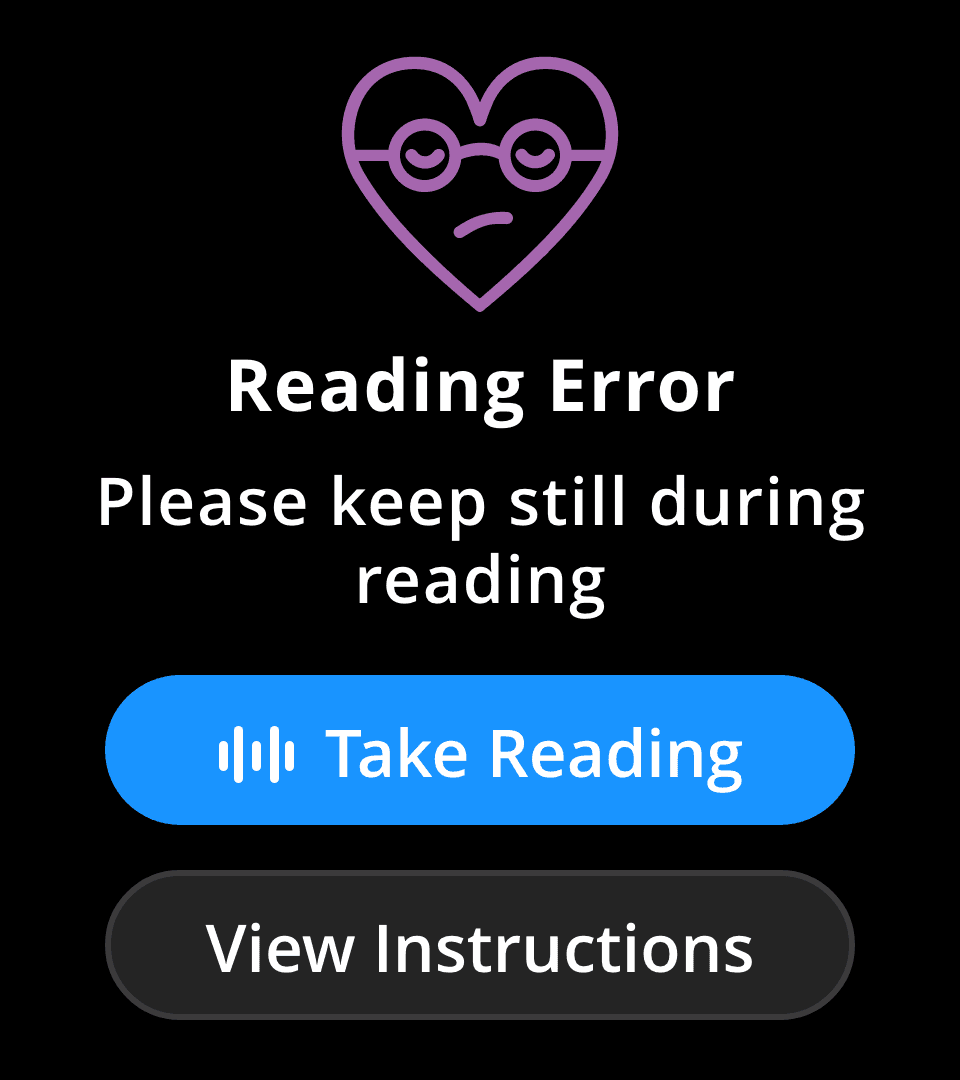
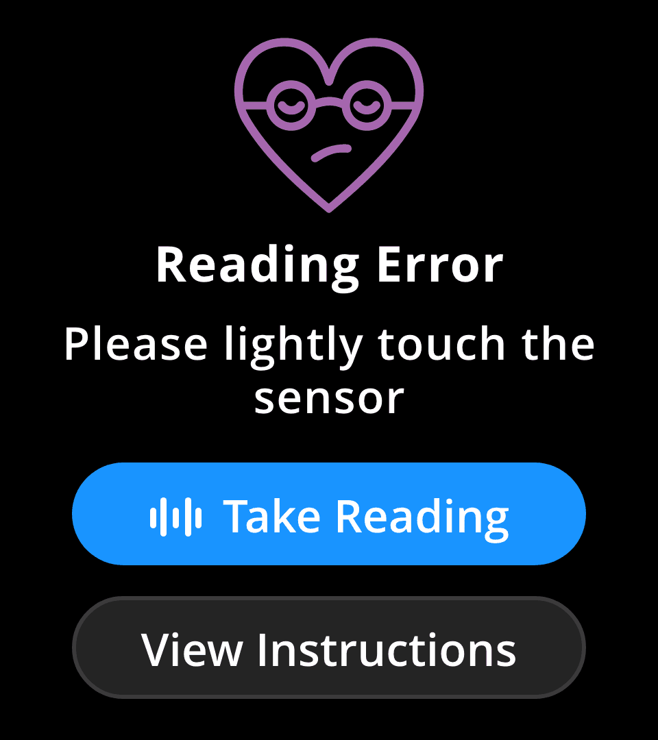

Guided Trial Readings – To improve accuracy and reduce frustration, we added an initial reading trial where users receive a rating from 0 to 5 based on their technique.
If a user receives a 0, it means the signal wasn't strong enough to get values from. The user must retry at least once before moving forward.
If they score 1 or above, they can proceed to a full reading or practice taking another one.

These changes helped create a more intuitive experience, reducing confusion and ensuring users could take accurate readings with confidence.
Design System
The design system for the Arty Heart Health was built mainly around Mobvoi's branding, to ensure consistency with their existing visual identity as well as adding in some additional elements based on our feature set.


Final Designs
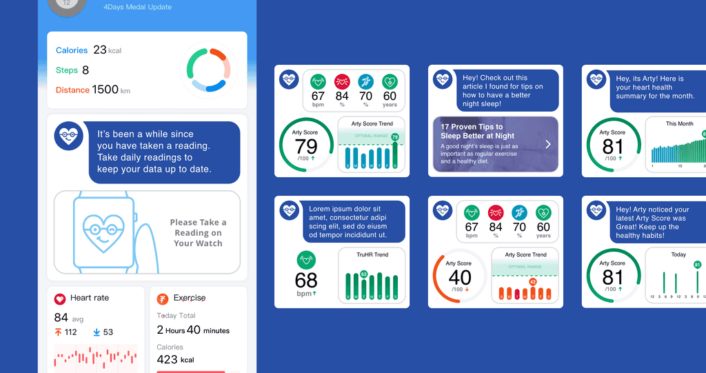
View Latest Readings
Get overviews of your current week right on your watch.

Dynamic Dashboard
The dashboard adapts in real time, updating with personalized cards based on the user’s results to deliver tailored insights and recommendations.
Key Takeaways
Challenges
This project was a collaboration with Mobvoi, where we integrated a PPG side sensor into an existing smartwatch. However, our partner had strict limitations on the information we could access, making it challenging to ensure a seamless user experience.
One major hurdle was the lack of access to Mobvoi’s watch screen and mobile app designs. Without these references, it was difficult to align our interface with their existing ecosystem, ensuring our contribution felt native to their product rather than an add-on.
Lessons Learned
This was my first experience designing for a smartwatch and working on a collaborative product with another company. Here's a few things I learned:
Designing for a watch face is an entirely different ball game—screen real estate is extremely limited, so every UI element has to be carefully considered for readability and touch interaction. Actionable elements need to be large enough for easy interaction, while still maintaining a clean, intuitive layout.
Working with external partners requires flexibility and creative problem-solving—when access to design assets is limited, you have to find alternative ways to maintain consistency, whether through indirect references, best practices, or close collaboration with the partner’s team.